The web has been talking about responsive webdesign and mobile ready websites for quite a while. The year 2014 could have been called the year of the responsive web. And building websites for clients I could’t have agreed more nor would I see myself building any website that isn’t a mobile first site.
Google Promotes Mobile Ready Sites
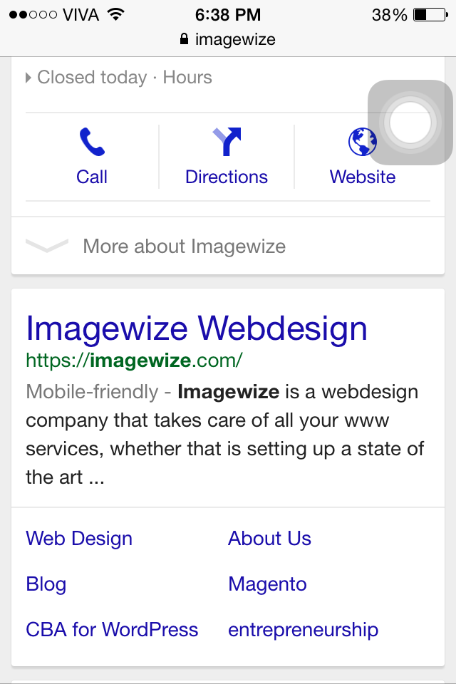
Nowadays when you Google for something Google will indicate whether that site is mobile friendly or not. Google has dedicated a lot of documentation on this. This page is a good start. When you now Google for a company or product and see the site in the results page it will indicate Mobile-friendly when it is:
Why Mobile Ready?
The reason a site should be mobile friendly or responsive is as Google stated “…so visitors can have the best user experience when they visit your site on a mobile device.” Another reason being us people. When we visit a site from a smartphone we don not want to scroll sideways so we can read your story or details on the product, let alone see the same version as the desktop version, but now fitting the tiny screen!
Test Mobile Readiness
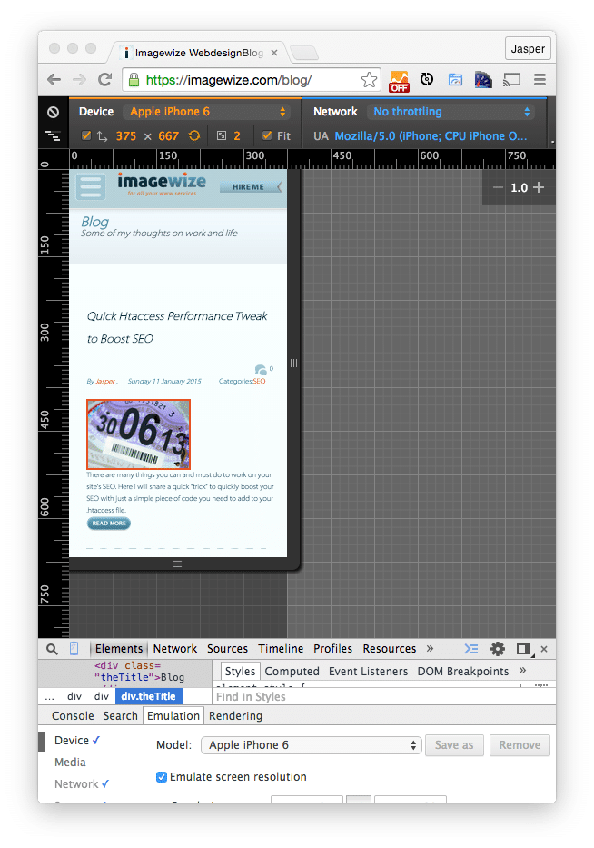
To test whether a site is mobile friendly is as easy as opening one up on smartphone or using Google’s Mobile Ready test site here. Another option is using Chrome’s Browser Inspector or Firefox’s Inspector to check for the mobile friendliness by loading viewing the site in different resolutions. This works most of the time as most responsive sites use media queries displaying different content and or content in a different way depending on the screen width.
Chrome iPhone 6 View:
How to make your site mobile ready?
The days of .mobile subdomains or domains that filter based on device type are pretty much behind us. Media queries in CSS are the norm. And Google does recommend CSS3 media queries as well. A css media query snippet from W3 Schools:
@media screen and (max-width: 300px) {
    body {
        background-color: lightblue;
    }
}
Here we tell the browser that from screen widths of 0 to 300px we will use a light blue background color for the body tag. Normally you will run at least three media queries, one for mobile, one for tablets and one for desktops. And in certain cases you use one for large screen as well. Bootstrap or CSS Skeleton have responsiveness built in and are very useful, but there are other CSS / frontend frameworks out there that can help you.